The redesign of candidates' assessment-taking experience using years of user feedback.

UI/UX Designer — Interactions, User Flows, Prototyping, User Research
Nagendra Gururaj, Director of Product
Sushmita Gejji, UX Writer
June 2021 - January 2022
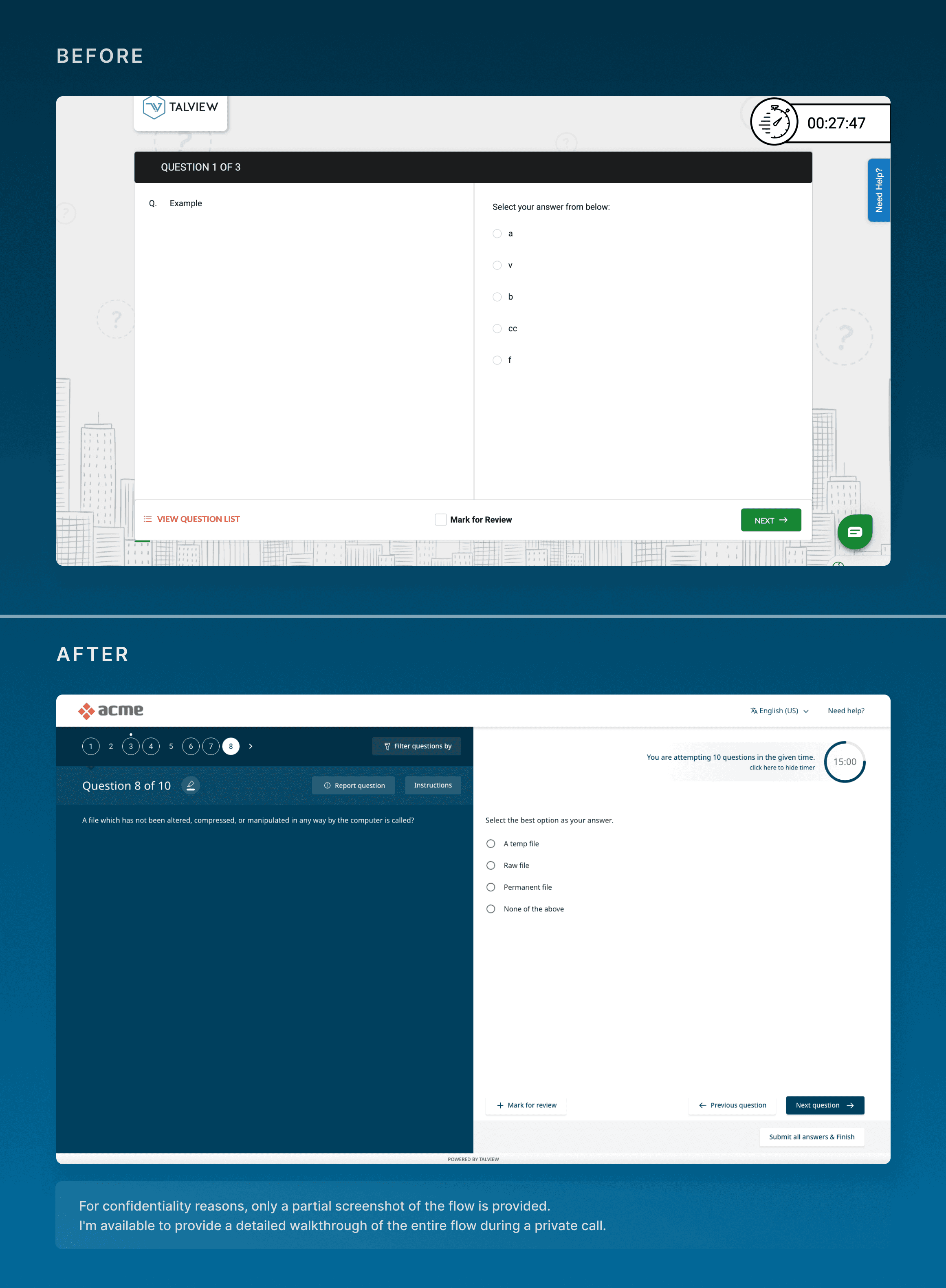
This case study shows how we used feedback from candidates over the years to redesign our candidate experience during assessments. It was my first end-to-end project at Talview, which makes it pretty special to me.
The user flows and user journey are deliberately kept unreadable since they are not intended for public access.
About Talview
Talview specializes in revolutionizing organizational interview and exam processes through its GenAI technology, emphasizing integrity, efficiency, and fairness. The platform employs advanced facial and voice recognition to ensure secure and non-intrusive remote interviewing and proctoring experiences. With a commitment to excellence, Talview has earned recognition as the #1 rated proctoring software provider, trusted by over 220,000 experts globally.
Our value proposition lies in delivering reliable assessments, streamlining processes, and offering insightful data, impacting decision-making positively. Across 120 countries, Talview has assessed over 10 million candidates, showcasing its global impact and dedication to setting new standards in remote interviewing and proctoring.
The Beginning
Since Talview was my first B2B company, one of my first learnings was understanding how much the roadmap prioritizes businesses over their end users. It also made research and user interviews harder as the candidates attending assessments weren’t our users, it was the clients'.
Inspite of these challenges, with Google Analytics and sheets and sheets of feedback from candidates completing assessments on our platform, I was able to bring visibility to a lot of problems we can fix.
So when Nagendra, our Director of Product then, announced that yes, we've got a green signal for a redesign, it was a no-brainer - I jumped at the opportunity. This was the first project I got to take on end-to-end, and I was beyond excited.
High level user flows & User journey Mapping
We started with a high level flow diagram of the existing Candidate Experience so we have a big picture of what we’ll be working with.
Since we provide many configurations & customisations for our clients, it took a couple of days to map every kind of assessment we provided and how the flows connected with each other. These were discussed and iterated with all the product owners so we don’t miss out on any tribal knowledge - it was all documented.
Next up, I hosted a user journey mapping workshop with the entire product team, as there were delays in getting client approval to interview their users. Everyone came with personas, did empathy mapping, and went through the entire process of the assessment. Got a bit heavy towards the end, but the outcome was so rewarding!

The mapping above is deliberately kept unreadable since it's not intended for public access.
Wireframing & Initial Feedback
I sketched out wireframes and prototyped it using Build.me which provided a sense of what we want to be going toward. We used these prototypes for initial discussions.
We connected with various functions, showing them our initial wireframes. Had more conversations around the why more than what and how. We wanted to give them an opportunity to influence the product design based on what they’ve been hearing from our customers.
"We wanted to have a competitive advantage through good design."
After speaking to our sales and customer relationship managers, we were able to understand that candidates taking interviews for our Retail customers had better access to mobile devices than laptops. And a seamlessly responsive platform would be very valuable for their use case. So responsiveness was added to our priority.
Sketch → Adobe XD migration & Tech Stack discussions
We wanted to focus on accessibility and being WCAG complaint as there’s going to be millions of candidates as users globally. So there were parallel discussions with the Engineering team on a suitable tech stack that provided out of the box accessible front end components. This was the same time when we switched from Sketch to Adobe XD as well. So with this project, UX and Engineering were getting equipped with new tools to handle this project.
High fidelity designs
I was designing the first version with an avalanche of feedback and insights when Nagendra checked in for an update. And as part of his usual encouragement, he said
"What you’re building now is going to be used for many years by millions of users. So build keeping the future in mind, than just for the present."
This made me step outside the box I was stuck in keeping the many tech & architecture limitations in mind, and broadened my horizon. I’ve often used this perspective to motivate my juniors as well. As new designers, I think it’s easy to get trapped in a tunnel vision, which is why having an inspiring team is so valuable.
So three days to go for my first presentation, I completely flipped my designs and came up with something new. I ran the draft by my team and tested with a few users to make sure I was on the right track. Armed with alternatives, I was ready to present my first iteration to the architecture team for discussing feasibility.
The new approach was definitely met with mixed reactions. There were many questions on various existing features and migration factors. I presented the new designs to each function, and one by one, increased the company’s trust in our journey. We were able to address all concerns and map out a roadmap for this product, in which we planned phases of our releases.
Live and Running - Testing & Sales
After 7 months of working with the Engineering team, making sure each component and breakpoint was tested, we were able to release the MVP. This was then released to a few clients to test and do user testing to get our first round of real feedback.
I was soon assigned to another team, and I had to handover this project to new designers to maintain and keep the releases consistent with feedback & metrics closely monitored.
One year later - New framework & adoption issues
After a year, I was reassigned to this project and got to understand that there were issues faced in adoption, and Engineering was switching to a new CSS framework, so there was a push for making some crucial changes.
We a dug a bit more into what exact issues were being faced and how best to tackle this. We got to know that:
Clients currently willing to make the switch to our new platform did not want to be restricted to a limited selection of colours when white labelling the platform for their use.
Multiple assessments were being sunset, hence was no longer required.
We partnered with new assessments, which needed to be compatible with out platform.
This led us to dial back a little, and take a very simple approach building a version that’s easy to white label and supports our partnered assessments.
Result? We got an average rating of 🌟 4.7 in 2024 which is a 20.51% increase!!
We successfully migrated more clients and onboarded new organizations, all thrilled with the updated interface. Raising our average rating from 3.9 to 4.7, we implemented major updates to our features and interface, and we aim to maintain this high level of satisfaction in the years to come.
That’s a wrap!
Roughly 3 years since this project’s inception, did everything work out as we thought? Not really. The 3 key things I’ve learnt from this project are:
To never get attached to a product. My former manager used to keep referring to this as my baby, which made it quite personal to me in the beginning. But as the feedback came rolling in and you’re faced with real user and business problems, it sinks in that you’re part of solving problems the best way possible, and that’s what the focus should be on.
When working in design teams, there are people who worked on a project before you, and there will be people after you. When you take up a project, make sure you’re actively involved in making a change for things you believe in, and paving the way for the next person to hit the ground running.
The value of documentation. At every step.
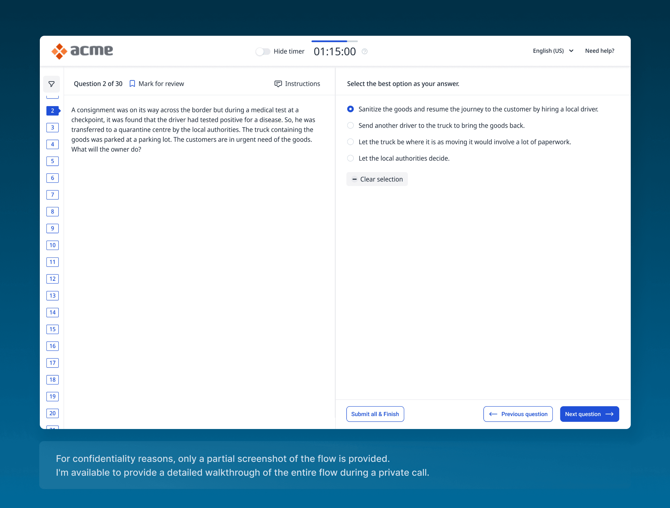
Disclaimer: This case study focuses on the process and results of the platform redesign, not the detailed design decisions. Due to the complexity of the platform, including all design aspects would be too extensive. However, I am available to discuss or walk you through these decisions over a call.


